For an updated printable version of this help click here
Common questions
How to add a time series plot?
How to add a scatter plot?
How to add a time series or scatter plot colored by a third variable?
How to add an individual time modification to an axis.
How do I save my session?
How do I share my saved session?
How do I delete a saved session?
How do I comment on a saved session?
How do I publish a saved session as a web page?
How do I change the time range of a plot?
How do I change the time range from multiple plots?
How do I know what data are available?
How do I learn more about data QA/QC?
OVERVIEW

Tool bar, the tool bar is a set of buttons that allow users to add new plots, save session, open session, download session as image, and remove all plots from canvas.
Canvas controls, these allow users to minimize, maximize, and remove selected plots.
Canvas, this is the working area where plots are added.

Plots, plots are elements added to the canvas by users during a session. Plots have tools to minimize, maximize, select, and edit the plot’s content. You will find a detailed description of these elements further in this text.
ADDING PLOTS
There are three different types of plots in Data Explorer: Time series, Scatter plot, and Colored plots.
Time Series plot

1- Click on “add new plot” button, the “Plotting parameters” window will appear

2- Select a station from “Source” in the “Plotting parameters” window, all the available variables will be displayed on “Variables” list

3- Select one or more variables and click on “Add variable” button. The selected variables will be added to “Y” variables. Notice that “X” variable value by default is “Time".

If you want to add variables from other stations, repeat steps 2 and 3. If you want to remove a series from “Y variables”, select the variable you want to remove and click on “remove button” (see image below).

4- Click on “Add series” button and the variables from “Y” variables will be moved to a list of plots. Click on “Next” button to change time/date.

5- After clicking “Next” the “Time range” menu is displayed. There are two ways to change the time range of the data: select one of the standard time spans (1,7,15,30 days) and select the end time or change start time and end time. Once the time was adjusted click on “Next” to select data quality. Note: the data quality option is available only for stations.

If you are not sure if data is available for the period of time that you selected you can go back to the previous step clicking on "Prev" and check availability for the variables that you want to plot.

6- The final step before obtaining a plot is to select what data quality and/or data quality levels we wish to plot, for more information about quality, data quality, and data queality levels click here
Select processed levels according to what you need to plot. When a processed level is not available the checkbox for such level is disabled.
Quaity levels (QL0... QL5) are applicable to PD2 only, to select quality levels PD2 need to be active and selected. Check Xpand to color different quality levels.

Scatter plot

1- Same as step 1 on “Adding Time Series plot”
2- Same as step 2 on “Adding Time Series plot”
3- Select one variable and click on “Add” button (for X variable), if you select more than one variable and click on add button only one variable will be added.

Notice the “T” button under “Add variable X” button, if you click on this button X variable will be time.
4- Same as step 3 on “Adding Time Series plot”
5- Same as step 4 on “Adding Time Series plot”
6- Same as step 5 on “Adding Time Series plot”
Colored Scatter plot
Time series and Scatter plots could be colored using a third variable adding a variable to “Colored by” field.

1- Follow the steps to create Time series plot from 1 to 3 or Scatter plot from 1 to 4.
2- Select a station, select a variable, and click on “Add variable Colored by” button.

3- Same as step 4 on “Adding Time Series plot”
4- Same as step 5 on “Adding Time Series plot”
How to add an individual time modification to an axis
Time can be added to any axes along with optional individual time modifications.
Adding Time with a Time Modifier
To add a Time Modifier there must be a modifier selected on the T.mod drop down list. By clicking on the desired axis T Button, time will be inserted in the axis. In order to apply a time modification to the desired axis a time modification must be selected. After selecting a time modifier clicking the desired axis T Button will add Time and the selected time modifier. Selecting None will only add Time without any time modifications. You will know if you added a time modifier by seeing the following format: Time:(selected modifier).
To Create a Plot with Individual Time Modifications:
An Example using SATURN03.

-

-

-

For this example we see that on day 204(Blue), which is July 16, the temperature at Saturn03 was about 21 degrees Celsius
and the salinity was about 3PSU. By the end of the day the temperature was about 13 degrees Celsius while the salinity was about 25PSU.
SAVING, OPENING and COMMENTING on sessions
Data Explorer allows you to save, retrieve, and share your work with other users. ONLY LOGGED IN USERS ARE ALLOWED TO SAVE SESSIONS.
A session is a set of plots active on the canvas.
Save session
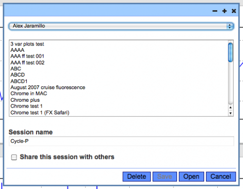
1- Click on “save session” button, a dialog window will appear listing your sessions.

2- Type a name for your session in “Session name” field. If you want to make your session visible to all users click on “Share session”, your session could be opened by any user (logged in or not), but could not be modified. Finally click on “Save” button, a confirmation message will let you know if the session was saved.

If you wan to share a single plot you could send an email with the plot's URL. Take a look at Plot Controls section further in this text. If you want to delete a session click on open or save session button to bring up the session dialog window, select the session and click on the "Delete" session button.
Open session
1- Click on “open session” button, a dialog session will appear listing your sessions.

2- Select a session from your list or change the current user to have access to other users’ public sessions. Click on “Open” button to open the selected session.
Comment on a session
1- Click on “comment session” button, a dialog session will appear showing previous comments and a text box to enter a new comment.

2- Previous comments for this session (along with author and time of entry) are listed in reverse cronological order at the top of the dialog box. Enter a new comment in the text box at the bottom and hit "Save" to save the comment or hit "Close" to close the dialog without adding a comment.

DOWNLOAD IMAGES
Another way to share your work without having to save it as a shareable session is to download an image with all the plots on your canvas. To do this click on “download image” button. Once you download the image you can attach it to an email.

CANVAS CONTROLS
Canvas controls allows users to minimize, maximize and delete SELECTED plots on the canvas. Remember canvas controls affect only the behavior of selected controls.

To select plots on a canvas you have two options: select all plots clicking on the select all canvas control (first canvas control at the left) or selecting plots individually using its “SELECT” plot control. When a plot is selected the plot is highlighted with a red frame.
PLOT CONTROLS
Some of the plot controls are similar to canvas controls, but only affect the behavior of one plot. The plot controls also add the plot options control and the download data control.

This control allows users to edit, clone, display URL, download data, and select a plot.
Edit plot, opens “plot parameters” windows and users can add or delete variables, change time range, change limits, and change layout of a plot. If multiple plots are selected a confirmation will ask you if you want to edit the current plot or all the selected plots.
Clone plot, creates a copy of a plot.
url, displays the URL of the plot. You can copy and paste the URL on an email if you want to share the image with another user.
Data, allows you to download the data used on a plot.
Select/Deselect, selects and deselects a plot to tie its behavior to “canvas controls”.
OTHER USEFUL OPTIONS
MLLW correction, this options controls how a plot from SATURN-01 profiler is rendered. This option is available only for SATURN-01, this correction removes the effect of the tides on the profiler’s pressure measurement.
Data availability, this control brings up a diagram representing years and months of data. This option is located under “Variable” select in the “New plot” window.
Data Quality Assurance/Control
Information on data quality assurance/control for the SATURN system is available here.
Last updated: January, 17st, 2014