You are here
Week 2: The Poetry of MATLAB
Matlab is a lot like poetry. I realized this as I worked on improving the program to "debubble" data from the Autonomous Nutrient Profiling Analyzer (APNA) so it could be processed. The APNA uses various reactions to find the concentration of Nitrite, Nitrate, Phosphate, Silicate, and Ammonia in the water. Since temperature is a factor in reaction rates, the water is heated before being analyzed. This causes bubbles in the water to come out of the water randomly and appear as spikes in the data (the APNA measures absorbance during a reaction). This tends to throw the data off if a measurement happens at a bubble spike instead of a plateau (figures of this below). That's why software compensation of the data is necessary.
Instead of attempting to improve the current algorithm, I decided to start from a blank slate. Instead of using the second derivative of the data to figure out where unwanted spikes would be, I used a statistical approach. In its current iteration, my program cuts out any points lying two standard deviations away from an average of a width of points around it. It then passes through the data with a smoothing function.
So how is this like poetry? The difference in the two debubble approaches is like the difference between two examples of well known of 'poetry'.
"Shall I compare thee to a summer's day ?
Thou art more lovely and more temperate:
Rough winds do shake the darling buds of May,
And summer's lease hath all too short a date"
-Shakespeare
"Deep in the jeans she's wearing
I'm hooked and I can't stop staring
Oh baby, I wanna get with you
And take your picture"
-Sir Mix-A-Lot
Completely differently in content and construction, but they ultimately accomplish the goal. In that sense Matlab is a sort of poetry. Wordplay with matrices. Succint in its simplicity, profound in its permutations. The language of love in a world ruled by Skynet. That's enough random ranting for now. To give better idea of what I'm doing, here are a few of the plots the program processed.

Figure 1-a: Raw Nitrate+Nitrite Data. Nitrate +Nitrite data sets tend to be the smoothest of the data sets.

Figure 1-b: Same data after passing through the old debubbler. Although the old debubble routine will sometimes cut spikes, it tends to leave the data looking almost the same as the original.
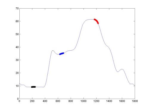
Figure 1-c: Same data after passing through the newest version of the debubbler.
That was relatively good, clean data. On the other end of the spectrum is the normally noisy Ammonia data.

Figure 2-a: Raw data

Figure 2-b: Original debubble

Figure 2-c: New Debubble
You may be wondering what the black, blue and red areas of the graph are. Those are averaged to obtain the base, sample and calibration measurements of each water sample. My next task is to make sure they always fall in the plateau areas. That will be a bit trickier than this week's task. Also, since the data is being heavily processed, I plan to include a confidence interval based statistical parameters of the raw data. Hopefully this streak of productivity will continue until next week.